The difference between UI and UX: a practical example
 Today there will be a guest post on the topic of UX and UI interfaces on the example of working with the Icons8 service. The author is a usability specialist Andrei Burmistrov, the text is published in the first person.
I know what you are thinking: well, another attempt to impose your opinion on the controversial and ever-discussed topic “What is the difference between UX and UI?”
Yes, you understood everything correctly.
The only difference between my article and other similar ones is that I will explain the differences between these two concepts with practical examples from my personal experience (as a usability specialist, I checked several projects on real people). However, my opinion is subjective, so you can be even more skeptical than Hugh Laurie in the first 10 minutes of each episode of “Dr. House.”
UI CAN “BREAK”, and UX – NO
For clarity of this thought, I will use one of the functions of the Icons8 site – “Collections”, which allows you to create icon sets.
I created a new collection and started dragging the icons I need there.
Icons8 icon collections
User Interface Collection:
Icon8 interface collection
So what is a UI? Everything you see above.
The user interface can be easily divided into parts. Then you can see the Icons8 interface as a whole, but it can be disassembled into components: category UI, collection UI, search UI, etc.
User interface
And then what is UX?
“UX covers all aspects of the end-user interaction with the company, its services and products.”
– Don Norman
In other words, “Collections” is a tiny part of the total UX on our site, because they are a tiny part of our product and related services.
Consider a real-world example:
John is an experienced Icons8 user. His current experience with collections strongly depends on how he previously interacted with our site and any other icon-based sites, and cannot be considered isolated.
Before you start using the collections, John has already managed to try other features, such as repainting. Therefore, when he works with collections, he expects that these functions will be available there.
The first conclusion:
UX can not be divided into parts, and the user interface (UI) – you can.
I deliberately do not say “UX Collections” because it contradicts the definition given by Don Norman. Collections are a tiny part of the whole UX.
You cannot take and isolate UX collections from the total UX, because nobody uses them in a vacuum. Before starting to work with them, customers probably looked for icons, read our newsletters or visited other iconic websites (which are also part of their interaction experience).
The second conclusion:
The UI is the same for everyone, but the UX is different.
I interviewed three site visitors: John, Alicia and Steve. At the same time, I did not do A / B testing of the user interface, that is, they all saw the collections in exactly the same way. However, the UX at all turned out to be different.
John received a letter announcing our new feature – the collection. Given the fact that he is subscribed to the newsletter, it is obvious that he has been on our website before. John is an experienced user. Recently launched collections solved his old problem: he could not download several icons at once. In the end – he is happy, he had an excellent experience of interaction with the service.
Alicia found our site through Google, and she is a completely new user. Alicia downloaded only one icon and left, she did not even see the “Collections” tab. What was her experience? No. At least her UX didn’t touch collections. Maybe it’s still a neutral UX? Not. She could have the same problem as John (the inability to load several icons at once), but she did not find a solution. This is a bad UX.
Steve uses collections daily. But after trying to add the 500th icon to his collection, he received the error message “Nothing found”. Steve also said that on another site he was able to create fonts from thousands of icons. Bad ux.
See you UX is different for everyone.
Remember that the UX can not be divided into parts, and the user interface – you can.
Moreover, the UX of different people cannot be isolated from each other.
We have two different user experiences. Should we study them separately? Not.
John had a great experience. However, we must be sure that we will not make his UX worse by helping the other two clients, Alicia and Steve. Each of them has its own problems with usability and poor interaction experience. And we need to make their overall UX better.
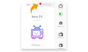
Let’s start with Alicia. She is one of those who simply do not notice the “Collections” tab in the upper right corner (and there are many such people). We tried to raise people’s awareness of “Collections” by adding such a notice:
Collection Notifications
Now, when people download any icons, we automatically create for them a collection called “Downloaded”, and this red notification indicates the number of new icons added to the collection. Alicia’s UX has been improved, but at the same time it has not made the life of John (the happiest client) more difficult.


