Trends and trends in web site design
 It was originally planned to place a translation of an English-language article on web design trends in 2017, but after studying various sources, we decided to slightly change the concept of this note. The thing is that over the past month on the Internet has been published a lot of thematic materials about current trends in web design, and opinions, as they say, have diverged. On the one hand, this is logical, since different authors have their own assumptions about what will be relevant for sites in the current year. On the other hand, these forecasts are very subjective.
In general, we have collected all the options and made up something like a digest of web design trends for 2017. Let’s start with the most popular trends that many experts note, and gradually move on to more “unique” ideas. By the way, if you have additions and thoughts on the topic, feel free to share them in the comments. Plus, we recommend reading about the trends of logos in 2017 – also a useful post.
1. NON-STANDARD “ABSTRACT” DESIGN
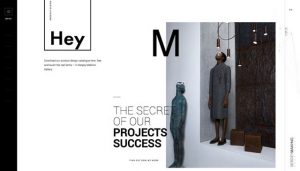
The grid for sites is considered a kind of well-established basic concept that helps to competently organize the space of a web page. Especially creative designers, she pounded in a certain framework. However, there have always been brave souls who create original solutions that are not controlled by any rigid boundaries. Such works, as a rule, are found in image and creative subjects, but in 2017 this trend of website design will spread to rigorous corporate projects.
Non-standard arrangement of elements gives more interesting possibilities: allows you to use all the space of the page, add layering of objects and a sense of depth to the layout. You will be able to realize design, impressive users even without colorful full-screen video or animation. Given the hundreds of thousands of classic layouts on the network, abstract unique solutions will almost always stand out and attract the attention of site visitors (by the type of WOW factor). And you need to use it!
2. NEW NAVIGATION OPTIONS
Non-standard project – advanced menu. Today you do not need to place horizontal navigation in the header. Due to the increasing popularity of adaptive layouts, many users have become accustomed to the Hamburger icon menu (consists of three horizontal bars), which is increasingly appearing on regular versions of sites. The line between mobile and desktop design is gradually erased. This year we will see a lot of experiments with the placement and the form of the menu – this can be one of the main trends in web design 2017.
Such solutions allow you to use page space differently. In addition to the intuitive scrolling down and to the side, as well as the fixed vertical navigation block, various hidden exit elements will be popular. With their help, you can place all the necessary submenu items on one screen. In a sense, this makes site navigation more detailed and useful for users. It is only important that they manage to deal with your non-standard solution. Be sure to test its effectiveness in practice.
3. CARDS IN DESIGN
Cards are not a new trend in website design, but in 2017 it will continue to be relevant. This solution effectively presents information on different platforms: from mobile applications to viewing on large TV screens. Such a format for organizing data will make it as convenient as possible for users to focus all information on objects.
This approach is used by many popular projects on the network: Facebook, Pinterest, Netflix. The last option is generally an excellent example of successful implementation of cards in design, which combines minimalism, navigation capabilities and efficiency.
4. SPLIT MAKETS WITH DIVISION OF THE SCREEN IN 2 PARTS
This year we will see more layouts with a split display of information on the screen. This trend of web design in 2017 will be especially active in home pages and Landing Page. Visually, the implementation looks great in minimalist designs with contrasting backgrounds or images.
The designer will be able to use various visual design techniques in the adjacent blocks within one web project. And the result will look natural. By the way, split layouts work well for Call to Action in landing pages. Read more about the method here.
5. BIG AND ORIGINAL TIPOGRAPHICS
I remember back in 2009 we published a similar article, where the use of huge fonts was one of the promising trends in site design. The same is likely to happen in 2017 (at least most designers mention it). The main reason is, of course, attracting attention: someone needs to select certain objects on the page, someone wants to explain how to properly use navigation, etc. Anyway, typography is getting fatter and bigger. When implemented, you may find useful blog posts about bold and bold fonts.
