
always find its audience
7 useful Chrome extensions for designers
 If you are in search of convenient tools for the workflow, congratulations: you have come to the right place. Team Dribbble offers you seven extensions for Chrome. They will help in finding fonts and codes for color, and even testing adaptive projects.
No matter what kind of designer you are, you definitely need at least one of these applications. Download, check and enjoy! Continue reading
How empty space killed corporate application functionality
 Spacious. Minimalistic. Clean. A large amount of empty space has become a classic trick in developing application design for consumers.
And I don’t really hate this trend. Effective use of empty space is attractive and can significantly improve the usability of a simple interface. Long live empty space!
But what about complex interfaces? Corporate application developers understand what I mean: control panels that support innovative technologies, information-intensive logistics systems, and accounting systems with large amounts of data. These are the tools our users use every day to do their work. Continue reading
Designer UI Cribs: Creating Buttons
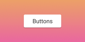 Buttons are my favorite design element. In this article we will look at the different types of buttons, types of interactions and states. To save time, let’s concentrate on the “normal” buttons. Therefore, we will ignore radio buttons, tabs, checkboxes, and other similar types of buttons.
1. Action buttons
In this section, we will look at the hierarchy of buttons and the language in which they communicate. Button actions are not determined by how they look (although users should be able to understand in appearance what a button means), but rather how they are used. Continue reading