

corporate identity
DeviantArt introduced a new redesign
 A year ago, we wrote that Wix bought DeviantArt – an online community for artists. As planned by Wix, the platform should become a haven of professionals. And it seems that all this time inside they were engaged in site redesign.
The new redesign is called Eclipse (Eclipse). Dark colors, everything is smooth and sleek – the site is aimed at professional creators who would like to sell their work. Community opinion, as usual, was divided. Yet most of the audience is just art lovers and lovers. Such a lurch towards the pros seems to them unfair. Continue reading
6 main stages of site development
 I was recently told in the comments that some posts do not match the format of the blog, which is positioned as a useful resource for web designers. On the one hand, a lot of attention is really paid to a graphic editor, for example, photoshop, but on the other hand, this is also part of the work, and not least. Nevertheless, today I decided to publish a post that would partially satisfy those who want to read something about creating websites. At the same time, I decided not to limit myself to one web design, but to consider the issue more broadly. Continue reading
Frequently asked questions (FAQ) – we are developing an effective FAQ section
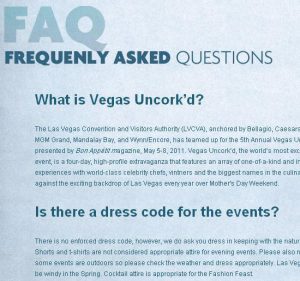 As you know, of course, the FAQ (Frequently asked questions) are frequently asked questions that are collected and highlighted on a separate page. Thanks to it, the user will be able to find the answer to his question without asking the forum or support service (support). The ideal FAQ page helps to deal with the site without any third-party support, unfortunately, in most cases this does not happen. The success of the FAQ depends on how well this page is designed and what is placed on it. In this article, written on the basis of the publication Designing Effective FAQ Pages, I want to make out some aspects and basics of a proper, working section in frequently asked questions. Continue reading