step by step
Hamburger menu: a bit of history and alternatives
 We continue to discuss the topic of navigation in web projects. After reviewing examples of bread crumbs, we decided today to talk about the so-called hamburger menu. There was a time when this element brought freshness and novelty to user interfaces on mobile devices. This icon has become not only an integral part of top mobile applications, but has also begun to be actively used in site headers (in adaptive versions and not only). It got to the point that the menu began to appear even where it was completely inappropriate. As a result, the criticism collapsed on the hamburger menu button, and the former favorite became the culprit in the controversy. Continue reading
Current trends and trends in logo design
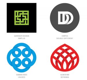
 Actual trends in the design of logos 2017 did not become some special revelation. Similar to the main trends of web site design, they are rather a continuation and development of what users have already seen last year. This question is quite well addressed in the Bill Gardner’s 2017 Logo Trends note, so we decided to prepare a translation of the publication.
Update 02/18/2018: We invite you to see a new article on the topic – about the tendency of logos for 2018. Looking ahead, we can say that some of the techniques remained unchanged, but there are also original ideas. Continue reading
The difference between UI and UX: a practical example
 Today there will be a guest post on the topic of UX and UI interfaces on the example of working with the Icons8 service. The author is a usability specialist Andrei Burmistrov, the text is published in the first person.
I know what you are thinking: well, another attempt to impose your opinion on the controversial and ever-discussed topic “What is the difference between UX and UI?”
Yes, you understood everything correctly. Continue reading


