Effective methods of split-screen design
 One of the most notable trends in web design in 2017 can be called the division of the screen into two parts. More and more web projects use a similar version of the layout, where two vertical panels are located next to each other. Split Screen Design follows a very simple rule: one screen, two messages. Each side includes a separate element: photo, text block or illustration.
Focus on two things
The method is particularly well suited for cases where you need to focus on someone else at once on two things. Thus, the visitor can instantly choose between them.
The split-screen design is not just a newfangled trend, but also a very original way to navigate your site. Looking more closely, you can see the following benefits in it:
He draws attention to something specific.
Plays contrasts.
Uses non-template format.
It is also an excellent choice when working with responsive frameworks. This type of design is ideal for navigation on a large monitor or tablet, but mobile devices do not remain deprived: the panels can be positioned vertically, one after another.
But the most remarkable thing about a split screen is an almost unlimited number of design combinations. In this article you will learn how to get the most out of this trend.
BEST SPLIT DESIGN OPTIONS
Using the split-screen on the site, you are able to equally emphasize the importance of both elements, while at the same time giving the visitor the opportunity to instantly choose between them. Thus, what appears on the screen becomes doubly important. It should be understood that the user will look for a visual connection between the divided blocks, so consider them as something similar to the concept of yin-yang. Here are some tips on how to implement Split Screen Design.
COMBINE COLORS AND EFFECTIVE TYPOGRAPHICS
Due to the increased demand for flat and material designs, color and typography now set trends themselves. Saturated colors stimulate visual perception, and effective typography emphasizes the content of the text. Connect them together – and you get a visually attractive and interesting layout.
Use bright colors
Combinations of bright colors and interesting typography can attract attention. The illustration is provided by the Baesman site.
ACCESS THE USER’S ATTENTION ON THE CALL FOR ACTION BUTTON
Split screen into 2 parts is an excellent tool for developing a visual theme, thanks to which calls to action will become even more visible. The negative space, combined with the characteristic vertical bar, helps to focus the attention of the project audience on important areas and key elements.
Call to action
In the screenshot-example above, attention is focused on the call to action on the left side of the screen. Excellent move in the design of landing, which many advise.
THINK SCREEN AS A CARD
Split design – a model that has arisen due to the popularity of “cards”. And all websites that follow this design trend, in fact, support this concept: the screen is a large-sized card, and at the same time, each block is a container containing one message and one action for visitors.
Division into cards
The left panel in the design of Si Le Solei is one card, while the right panel is a pair.
The location of the elements may vary depending on these very objects. For example, in the illustration below, the right side is divided into several small parts.
Mosaic of pictures
Option arrangement of pictures in the form of a mosaic.
Tip: Try to make the blocks look as simple as possible: on the cluttered screens, the user interface seems very congested.
CREATE A VISUAL TRANSITION BETWEEN SCREENS
And although the patterns in split-screen design can differ dramatically in the variety of elements, there must be a definite connection between the containers in which they are contained. One possible way to make this connection is to use color. Duplicate the distinctive color to make a visual transition from one part to another. This works especially well with the color of a brand or with a very contrasting tint:
Contrast and brand
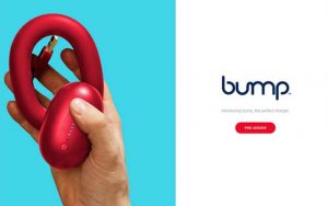
Here, for example, they duplicated the color of the brand for a visual transition from the picture with the product to the screen with pre-order of this product.
Duplicate contrast color
And here, to provide a visual transition, duplicated high-contrast color.
Another method is to overlay one element (for example, text) on two screens. Similar can provide additional communication:
Text overlay
Details in a split screen design may overlap both sides. Illustration courtesy of the Sewage Free Seas website.
