

articles or thoughts
How empty space killed corporate application functionality
 Spacious. Minimalistic. Clean. A large amount of empty space has become a classic trick in developing application design for consumers.
And I don’t really hate this trend. Effective use of empty space is attractive and can significantly improve the usability of a simple interface. Long live empty space!
But what about complex interfaces? Corporate application developers understand what I mean: control panels that support innovative technologies, information-intensive logistics systems, and accounting systems with large amounts of data. These are the tools our users use every day to do their work. Continue reading
Professions of the future: who is a technical designer?
 Often disputes arise between developers and designers – which of them plays the main role. Ask this question to the HR manager, and you will get an answer like, “Both teams are equally important.” This is bullshit.
If you compare the product with a huge cruise ship, the development team will be something of an engine. It would seem that without a motor it is completely useless. But on the other hand, let’s say you want to book a cruise. You do not care about the engine – you look at the photos of the ship, how the cabins are equipped, how high-quality the service is. Of course, for such a huge ship the engine is very important. But if no one wants to book a cruise because the design of the ship sucks, what’s the difference, how good is its engine? Continue reading
Why cancel buttons should be colorless
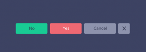 What exactly does the Cancel button do? It returns the user to the previous screen. For users, Cancel is a means of protecting against unwanted changes in the system. To make users feel safe, the Cancel button should mean a retreat to reliability, not a call to action.
That is why the Cancel buttons should be colorless.
Neutral color for neutral button Continue reading