Designer UI Cribs: Creating Buttons
 Buttons are my favorite design element. In this article we will look at the different types of buttons, types of interactions and states. To save time, let’s concentrate on the “normal” buttons. Therefore, we will ignore radio buttons, tabs, checkboxes, and other similar types of buttons.
1. Action buttons
In this section, we will look at the hierarchy of buttons and the language in which they communicate. Button actions are not determined by how they look (although users should be able to understand in appearance what a button means), but rather how they are used.
1. Call to action buttons (CTA / C2A)
The call-to-action button, depending on the situation, usually encourages users to register / buy now / login, etc. Such buttons should be used where the platform wants to strongly suggest an action to beDesigner UI Cribs: Creating Buttons.
Call to action button.
For the call to action, I like to use rounded buttons, as they attract attention rather effectively.
2. Primary action
Although the call-to-action and primary action buttons may look the same, I would like to separate them. While the CTA buttons perform their function, the primary buttons should be a strong visual indicator that will help the user make the journey. These buttons should be used in situations where the user wants to “Complete”, “Start”, “Next” and so on.
Primary action button.
For buttons of this type, I use simple rectangular buttons with rounded edges.
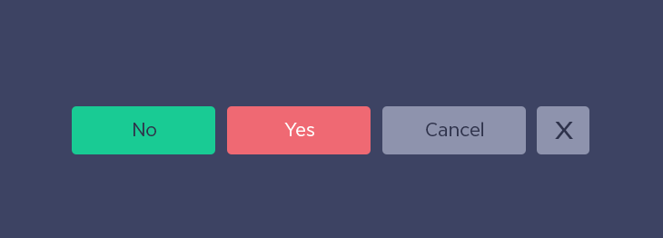
3. Secondary action
The secondary buttons are the “Back” button next to the primary “Next” button. Or the “Cancel” button next to the “Confirm” button. Secondary buttons are an alternative to the primary action that we provide to users.
Two options for secondary action next to the primary.
For these buttons it is recommended to use the contour buttons or text links.
4. Tertiary effect
Tertiary buttons are usually used for different actions. For example, when the action is important, but may not correspond to what the user wants to do at the moment. It can be a “add friend”, “change”, “add new” or “delete” button, provided that these actions are not primary.
Tertiary buttons in different forms.
Simply put, for this you need to use less noticeable button styles.
2. Common button styles
In this section, we will look at common button styles. Style is just the aesthetics of a button, not how it should be used.
Solid button.
Contour and ghost buttons
Contour buttons are buttons with no fill. Although they are often used interchangeably, the contour buttons are usually light in color (with a dark outline and text), and the ghost buttons are in a dark color (with a light outline and text).
Contour button (left) and ghost button (right).
Rounded buttons
The rounded buttons are the buttons whose radius of the corners is rounded to the maximum.
Rounded button.
Note: The adjacent rounded buttons look awful. Every time when you place several rounded buttons next to it, a UI designer cries somewhere.
FAB (floating action button)
Floating action buttons are a thoughtful design solution, popular with Google Material Design. Although they may look like a button with an icon, in fact they are used for the primary action on the screen.
FAB button.
Text link
Text links are a very simple type of button. There are several ways to show that the label is a link. This can be a color, underline, link position, or just the text itself (for example, “Read more”).
Making text links.
When it comes to color, most sites use blue, as it is most identifiable as a link.
Button “icon with the inscription”
The popularity of buttons-icons has increased, but some buttons still need labels to correctly convey a message.
Button “icon with the inscription”
The most difficult thing about working with such buttons is to find the correct ratio of icon and font.
Option 1: the size of the icon corresponds to the height of capital letters.
Option 2: The size of the icon is much larger than the height of the line.
Warning: If the icon is only slightly larger than the height of capital letters, it will look inharmonious.
Button icon
There is no label on the icon button, only the icon is present. Thanks to this they save a lot of space in the interface. They also allow you to place other buttons and icons on a small space.
Buttons icons in different styles.
Warning: If you are developing a product for people who have problems with computers, use the button marked. Especially for buttons with more abstract content.