9 tips on typography site
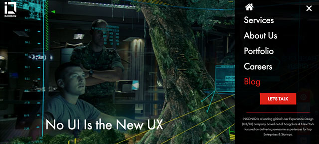
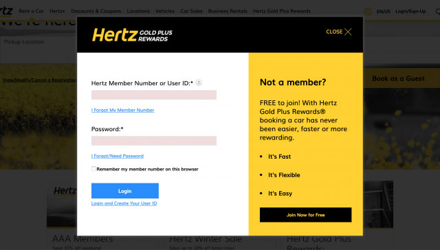
 Typography for a web site is a rather important design element that is not expressed very strongly in Runet. This question is more often raised on English-speaking foreign design blogs, we have practically no attention paid to it. No, of course, when creating a layout, most designers think about fonts, design, but very modest and few. Therefore, probably, in Runet you can count on your fingers the number of projects with bright creative and non-standard typography, more than the standard dull “gray” design:
Perhaps this is why Dmitry Naumov decided to share an interesting guest post on the topic. Dima concurrently, by the way, is the author of a very useful project Converlab – “Design. Usability Conversion. “So, let’s go directly to the tips, they will be a great addition to the article on trends in typography of sites.
1. SELECT FONT
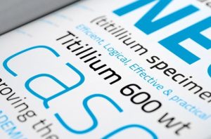
A lot depends on the choice of font. Font design determines the mood, conveys “character”, and indeed has a strong influence on perception. Choose the font that matches the style and concept of your site. For example, a traditional serif font, like Times Roman, will go for a “traditional” design, a sans-serif font, Arial or Helvetica, can be used for a “modern” design;
2. FONT SIZE
Particularly important is the font size of the main body of the text. The heading / subheadings can be grotesquely large and clumsy, but the main text should be comfortable, which is possible only with optimal size. This is usually 12-16 px;
typography
We also recommend reading:
Top 10 Google Fonts for Headers – Free and Most Popular Solutions;
CSS styles of website headers – design examples through CSS code.
3. STYLE SET
The font should not be monotonous, gray mass is not pleasant to read. Develop a style system for headings and subheadings (H1, H2, H3, etc.), quotes, main text, and the like. Use different font sizes for this, variants of its type, perhaps for contrast for this purpose, use another font (especially for headings or quotations);
4. ACCENT
Important places in the text must be allocated in bold or italics. The main thing is not to overdo it. Emphasis is on it and emphasis then on what should be used dosed out;
site typography
5. COLUMN WIDTH
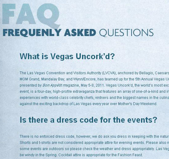
In traditional typography, much attention is paid to the width of the column, for this reason the text is divided into columns in newspapers and magazines. If the string is too long, it is not convenient to read it. Because you have to go too far from the end of one line to the beginning of the next. The short line is also not good. The optimal string length is in the range of 70-140 characters;
6. INTERLINEAG (LEADING)
Leading (Leading) – the distance between the lines. If it is small, it has a negative effect on readability. Too much Leading promises nothing good either. In general cases, you are likely to fit 2-4 points more than the font size;
7. GENERAL STRUCTURE OF THE PAGE
Ideally, a single grid should be used on the page. In this way, you can achieve a harmonious look for the whole site. Try to use common rules and styles (which you came up with) throughout the site;
8. COLOR AND CONTRAST
The text should be well read, for this it should be a contrast. It is better to use the classic black and white solution, this combination has the greatest possible contrast, so it is most convenient to read. The remaining combinations should be tried with great care.
9. WHITE SPACE
White space is not an emptiness, but an important design element. Do not sculpt the elements too closely, always leave some “air”. This way you can achieve a clean, light, pleasant design.
——
First, thanks to Dima for the post. Everything is said briefly and in essence, in essence, the topic can be developed infinitely on each of the points. I think some of the answers to the questions can be found on his website Converlab. In addition, I wanted to add on my own that if you decided to do something “such” in terms of the typography of the site, I would advise you to review various collections on the Internet with original solutions before work. It is very inspiring, and also contributes to the emergence of creative ideas.
