Web 2.0 style design: simplicity as art
 In the fall of 2005, with the help of the publisher Tim O’Reilly, the term Web 2.0 was firmly included in the lecture of web developers. Like any new term, it still remains the subject of lively discussion, during which the main feature, which is no longer in doubt, is defined. Coming to replace the “old” Web 1.0, Web 2.0 has become a new model of the existence of the Internet community, where an ordinary user becomes a direct participant and creator of the site content. From now on, the priority tasks for the developers were a friendly interface and a simple, but at the same time stylish design, which determined the characteristic features of the design in the Web 2.0 style.
Consider what design techniques are used most often when developing websites in the style of Web 2.0, so to speak the main features of the style.
Nothing extra. Simplicity is becoming a top design priority. Rejection of additional decorative elements radically simplifies navigation and concentrates the user’s attention.
Attention to the center. Now the vast majority of sites, the bulk of the information is located in the center of the screen. This not only allows you to see the usual placement in any browser, but also simplifies perception at the expense of visual ease.
Three columns – the limit. If a few years ago placing material in three or four columns was the norm, then in the design of Web 2.0, the developer will have to keep within the minimum number of columns without cluttering the screen to the brim.
By Senka and hat. Of course, a separate horizontal section at the top of the page, separated from the rest of the content, was used before. But now you can’t do without it, because it essentially becomes the main navigation reference point.
Red – wait, green – go. The functional areas highlighted in different colors help the user to quickly navigate in the navigation, the main content, the reference array or other material.
Simple navigation. Each page of the site displays a clear, simple, clear and at the same time quite a large navigation menu. The same recommendation applies to the reflection of hyperlinks, they should be well different from the rest of the content on the page.
Clear logo and original icons. In the design of Web 2.0, a noticeable, vivid and memorable logo that fits into the minimalist environment of the page content works very effectively. Also of great importance are easily recognizable icons for the most important elements of the site, it improves navigation and usability of the site. We have already written the logos of various blog projects about Web 2.0 – we advise you to read, or even better, look at the whole picture in the article.
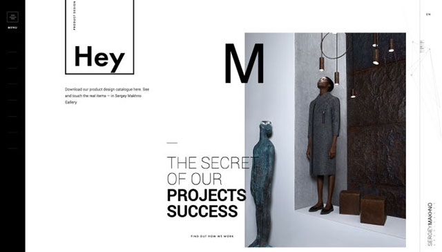
We write in capital letters. Web 2.0 style sites usually use fairly large font sizes. Large size allows you to keep the simplicity and functional design, because the small print is perceived more difficult, especially with fast scrolling or on LCD monitors in bright sunlight.
Large text inserts. The democratic Web 2.0 design allows for very large headings and other text insertions. This technique is most often implemented in the form of a graphic object and makes it easy to capture the user’s attention, even when browsing the page.
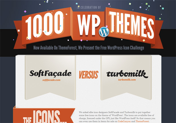
Bright colours. Green, muted orange, blue, pink – most often these bright juicy tones are used in the design of Web 2.0, and allow you to draw the visitor’s attention to important elements of the page.
3D effects. Since this type of design uses a very small amount of photographic material, designers often use simple, pixel graphics, and moderate use of shadows, gradients, reflections, reflections, etc. help to make the interface more real and pleasant for perception.
Outbreaks asterisks. These small labels in the form of flashing stars help the visitor to draw attention to important sections of the site, for example, price tags for sales, etc. We also recommend to look at the article badges in the style of web 2.0 for the site, where we have collected a couple of suitable examples.
We hope our recommendations will help the developer to take into account the main features of design in the style of Web 2.0, which today remains not only a manifestation of fashion, but also evidence of the popularity of Web 2.0 technologies. As for examples, the Internet is now very, very many services that can not only boast the appropriate design, but also offer us functionality in the framework of the famous Web 2.0. Many examples of such sites can be found in my blog Webdvanol notes, where I collect reviews of Internet services and sites that are useful to people. There certainly will find many websites with Web 2.0 design. By the way, if we talk about designs and examples, then something can be found in the selection of web design trends (in 2009, there are 3 parts), but in general, if you are an active Internet user, then finding such solutions is not so difficult:
Mozilla website
skype
In most cases, by the way, this style is characteristic of the English-language Internet.


