
Compared to the login forms
Cocktail vintage and innovation: retro style in web design
 According to the American writer John Steinbeck, the majority of people are ninety percent living in the past, seven now, and only three percent remains for the future. Well, the calculations of the Nobel laureate in literature are too difficult to verify, but one cannot dispute the fact that the events of the past are attractive. If the pressing sense of the value of the passing time and the attractiveness of antiques is familiar to you firsthand, perhaps the retro style in web design will be your fad. It remains only to think whether the retro concept will satisfy the target audience of the resource. Who will be delighted with the content of the masterly powdered antique? Continue reading
Ways to navigate users on the site
 Imagine that you are traveling by car, but because of traffic jams all main roads are blocked, and you need to turn into an unfamiliar part of the city. For some time traffic signs will help you to move in the right direction, but suddenly they will disappear. It seems that getting lost in an unfamiliar place is a pushover.
Any site, regardless of its ultimate goal, should perform the main task – to indicate to the user the path to the information of interest. However, it is possible due to his own fault, and maybe the fault of the designer, the user is lost and does not know where to go next. How to help your visitors navigate the site. There are several effective ways. Continue reading
Frequently asked questions (FAQ) – we are developing an effective FAQ section
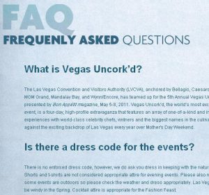 As you know, of course, the FAQ (Frequently asked questions) are frequently asked questions that are collected and highlighted on a separate page. Thanks to it, the user will be able to find the answer to his question without asking the forum or support service (support). The ideal FAQ page helps to deal with the site without any third-party support, unfortunately, in most cases this does not happen. The success of the FAQ depends on how well this page is designed and what is placed on it. In this article, written on the basis of the publication Designing Effective FAQ Pages, I want to make out some aspects and basics of a proper, working section in frequently asked questions. Continue reading