7 popular typography trends in web site design
 Typography is the style, location and appearance of printed letters / texts on a page. Currently, it has already become an integral element of web design. A lot of interesting articles on the topic can be found in the corresponding section of our blog, which has been replenished today with another publication. Consider the current design trends for this direction that emerged and entrenched in 2018. The material will be a great addition to the record of web typography. Post is a translation of this note.
typography trends
The goal of any site is to attract the attention of visitors. At the same time, it is important not only what you are going to convey to the audience (content), but also how you are going to do it (design). In 2018, the content continues to thrive, thanks to enthusiasts of the concept of Content First, implying its high priority in the design of web projects. Below are the trends of typography in 2018, many of which involve placing text in front, in the center and even across the screen.
In 2006, an article by Oliver Reichenstein “Web Design – It’s 95% of Typography” was published – the second of the sensational events of that period after the comedy “Borat”. According to Reichenstein: “Web design is not just a selection of original fonts, but techniques for their skillful use.”
1. BROAD, LARGE HEADLINES
The catching headline, in large bold or bold type, is perhaps the most effective use of text as a meaningful element of web pages. Now there is a tendency to replace the main “Hero-images” with large headings that connect the main one with the brand name or important information.
Currently, the beautiful typography of the site is gradually turning into its design. The company CreativeDoc, for example, skillfully uses a catchy title of six letters, typed in bold white font, on a strict black background.
Great headlines
Font: Dharma Gothic Heavy
The European innovation company Souffl chose a white bold inscription, extended vertically, on a dark background with the addition of splashes of color animation.
Original elongated font
As an option, see a selection of the top 10 Google fonts for headlines.
2. AND AGAIN SNACKS
Serifs continue their ascent to the heights of popular trends. Elegant titles and intricate headings typed in popular serif fonts such as Calluna and Minion change the looks of even the most inveterate skeptics.
Many web designers are actively using this new-found serif predilection — for example, at Cobble Hill and Gin Lane, they help bring an element of refinement to minimalistic sites:
Serif fonts
Fonts: Arno Pro and Proxima Nova
Typography in typography
Font Selected: Miller Disp, Lt
3. SKILLED USE OF NORMAL TEXT
The visual revolution, which, among other areas, is particularly pronounced in publicism, does not reject the importance of text in web design.
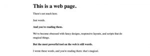
The “Words” project of Justin Jackson has existed for many years as a confirmation of the fact that with the help of ordinary phrases, sentences and words on the web you can say a lot. There are no fonts here, only a browser font with standard methods for its design:
Standard Browser Font
Some professional designers and to this day use in their web resources only one word, which Jackson calls “the most powerful tool for communication in the network.” In fact, it is not at all easy to create a page consisting solely of textual content – but if it is well done, we will not even notice the lack of images.
As an example, the site of the agency B14 from Copenhagen is suitable, where the entire space of the main one is filled with content that tells about the company’s activities:
Webpage design of words
Font: Maison Neue
Images can sometimes speak louder than written letters, but they do not have the same great control over what we perceive by ear — that is, words.
Freelance copywriter Joe Coleman adds a small detail on the page with text alone – an unusual interactive scroll button. This element not only helps to tell the desired story, but also (more importantly) entices the audience in a way inaccessible to many independent visual effects:
Scrolling text
Work sans font
The portfolio of designer Max Kaplun confirms that it is possible to attract the attention of the audience not only with massive bright hero-pictures, but also with plain text content. The main content of the main web page is a few sentences about the author and his professional skills, to which the talented specialist adds different characters; variations of fonts, size and thickness of letters; as well as a color cursor with certain hover effects / actions.
Original typography
4. MONO-WIDE FONT
In 2018, these fonts appear not only in text with small sizes of printed characters, but also as large objects in the design of online projects.

