DeviantArt introduced a new redesign
 A year ago, we wrote that Wix bought DeviantArt – an online community for artists. As planned by Wix, the platform should become a haven of professionals. And it seems that all this time inside they were engaged in site redesign.
The new redesign is called Eclipse (Eclipse). Dark colors, everything is smooth and sleek – the site is aimed at professional creators who would like to sell their work. Community opinion, as usual, was divided. Yet most of the audience is just art lovers and lovers. Such a lurch towards the pros seems to them unfair.
All changes can be found on the site preview. We will highlight the main points.
New visual approach
Dark, clean, hyper-temporarily. Although the new design still has shades of green, but it no longer dominates.
Current DeviantArt Design
The community believes that the new design breaks old customization options. At least, it seems so from several screenshots. In addition, he is too similar to the competitor ArtStation.
By the way, about the screenshots. We would include more examples from real UX, but they simply aren’t. The site itself is in beta and you can get there by invitation, but the team does not share real images. It’s a bit strange…
No third party ads.
In DeviantArt decided that about forty million users do not need third-party advertising. The site is going to advertise their own products and services, as well as advertise several “trusted partners.” For such a large site is a good idea. This can seriously reduce the number of malicious programs.
User profiles
Now heders will appear here (because they are everywhere) and new layouts for galleries. At the same time, judging by the screenshots, any possibility of customization will disappear. Unequal exchange for users.
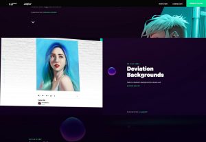
Deviations
An interesting concept is waiting for users in the Deviations section. Now users can use a background image or picture to represent their masterpieces. Most likely, this site bandwidth will fall because of this, but you can see the picture in a real gallery.