
Monthly Archives: July 2019
7 useful Chrome extensions for designers
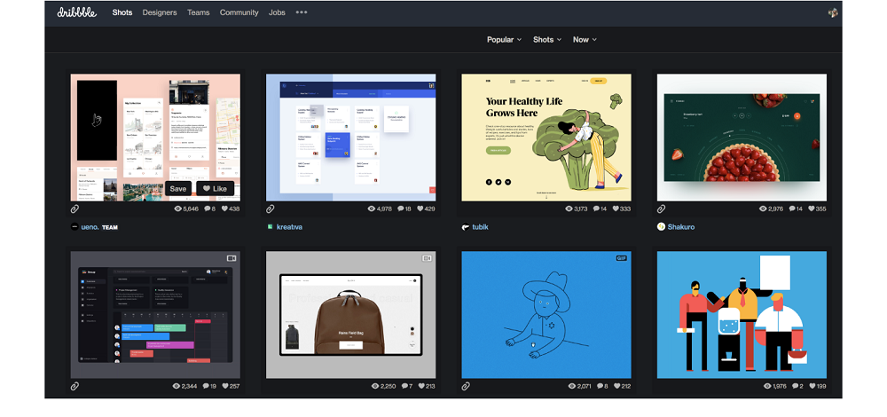
 If you are in search of convenient tools for the workflow, congratulations: you have come to the right place. Team Dribbble offers you seven extensions for Chrome. They will help in finding fonts and codes for color, and even testing adaptive projects.
No matter what kind of designer you are, you definitely need at least one of these applications. Download, check and enjoy! Continue reading
How empty space killed corporate application functionality
 Spacious. Minimalistic. Clean. A large amount of empty space has become a classic trick in developing application design for consumers.
And I don’t really hate this trend. Effective use of empty space is attractive and can significantly improve the usability of a simple interface. Long live empty space!
But what about complex interfaces? Corporate application developers understand what I mean: control panels that support innovative technologies, information-intensive logistics systems, and accounting systems with large amounts of data. These are the tools our users use every day to do their work. Continue reading
DeviantArt introduced a new redesign
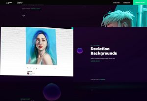 A year ago, we wrote that Wix bought DeviantArt – an online community for artists. As planned by Wix, the platform should become a haven of professionals. And it seems that all this time inside they were engaged in site redesign.
The new redesign is called Eclipse (Eclipse). Dark colors, everything is smooth and sleek – the site is aimed at professional creators who would like to sell their work. Community opinion, as usual, was divided. Yet most of the audience is just art lovers and lovers. Such a lurch towards the pros seems to them unfair. Continue reading