How empty space killed corporate application functionality
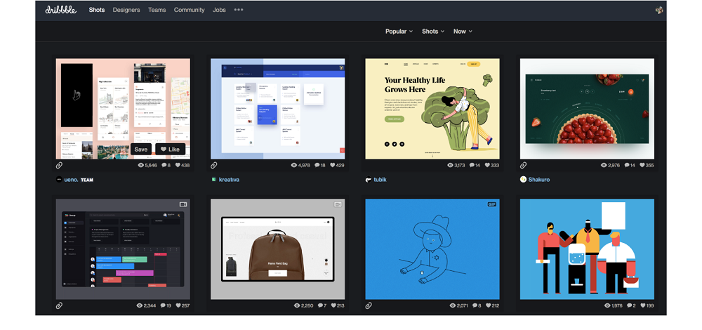
 Spacious. Minimalistic. Clean. A large amount of empty space has become a classic trick in developing application design for consumers.
And I don’t really hate this trend. Effective use of empty space is attractive and can significantly improve the usability of a simple interface. Long live empty space!
But what about complex interfaces? Corporate application developers understand what I mean: control panels that support innovative technologies, information-intensive logistics systems, and accounting systems with large amounts of data. These are the tools our users use every day to do their work.
Let me tell you one sad story
The main hero of this story is UX designer of a large high-tech company. He needed to redesign the internal control panel, because the panel was ugly, difficult to learn, and full of content on all screens.
Therefore, the designer solved the problem, relying on modern consumer applications. And he had good intentions.
With the help of the new design, it was possible to simplify each screen. He broke huge pages into smaller pages to make it easier to focus. And used a phased submission of information to hide supposedly less important information. And since modern users do not object to scrolling, in all the usual places – around the headers, blocks of content and in the rows of the table was empty space. The expanse was great.
But users simply hated the new system. Of course, the old system was ugly, but it had everything that was needed – and right at hand! Their work was evaluated in terms of performance, and required speed – they worked in a call-center technical support. They did not have time to click or scroll to search for information, their watch was literally ticking.
In their opinion, the redesign was not only meaningless, but impeded and annoyed. This lasted a month until the company got rid of this redesign.
What conclusions can be made?
Big business means a huge amount of data. And thousands of workers need to quickly navigate through this data without losing time for a long interaction with the interface.
You would agree that you would not appreciate a dictionary containing only 10 words on a page, because to search for a word you would have to scroll through a huge number of pages!
But this does not mean that your interface should be terrible.
A well-designed data density can display a wealth of information on each screen, while maintaining a clear and scanable content hierarchy. If done correctly, users can quickly and accurately access the necessary data. And this will not affect their ability to read the text or interact with the application as a whole.
Below are some recommendations on how to increase data density without reducing the modern aesthetics of your application.
First try to reduce the amount of data.
Before you start reducing font sizes to fit more data on each screen, see if all of this data is important. Ask yourself:
Can I delete extra data? Many systems randomly display the same data several times with slight differences (massive tables are the place from which to start searching for duplicates).
Are there things that users really should not see right now? If you do not know, ask! Find out if they use everything that is provided to them.
Will I improve the design by grouping related information? Not every element of discrete data always needs a separate table cell, even if it is already stored in the server system. Find out where you can reduce visual complexity by combining elements. For example, specifying the first and last name of the customer in one field.
See also: Adobe Creative Cloud 2018: four new applications and lots of updates
Hard to scan
Convenient to scan
Use useful typography standards
“The interval is needed to quickly read long, absolutely meaningless lines, such as serial numbers. In addition, it is useful for shorter lines, such as phone numbers and dates. ”


