The ideal form of authorization – how to do not need
 Recently, we posted a number of useful tips on creating effective registration forms on the site, and today we want to talk about the authorization / login unit. Recently, a lot of annoying and too “abstruse” of its implementations appear on the network. It is good when designers try to make unusual and beautiful login forms (see our selection), incorporating them into the overall concept of a web project, but it’s quite another thing when they overdo it with functionality. Sometimes it comes to the fact that popular password managers (in Chrome or from 1Password) just do not work.
In the article you will see examples of authorization forms with problems in usability. This is good food for thought for web developers who do not really understand exactly how their audience uses the login tool on the site. In the second part of the article, we will show and tell you how best to accomplish this task and create simple, binding, recognizable elements that are clear to visitors and work well with different “memories” passwords. The text is an adaptation of this note.
WHAT NOT TO DO
Here are a few approaches that are far from the most ideal and convenient solutions. They are best avoided.
LOGINS IN MODAL WINDOWS
Login form in modal window
A person has to perform additional actions: press the button in the menu, select the option with login, fill in the form. Instead, you could simply go to the login page manually (by link, from bookmarks) or add action processing directly in the header of the site.
In addition, the modal pop-up trigger mechanism creates additional difficulties for programs like 1Password – the “Open and Fill” function, which allows you to quickly enter your credentials when visiting the site, most likely will not work.
The inability to directly redirect the user to authorization. This will be a headache for customer service professionals, because they will have to give the user a bunch of instructions, instead of just providing a link.
DO NOT HIDE THE FIELDS
Hide login fields
The initially required Last Name field on the Delta website is hidden, probably in order to offload the user interface through phased disclosure of data. The point is that when a required element becomes invisible in the login form, password managers cannot prefill it. A person needs to get out of one field in order to gain access to another “super secret”, which will immediately appear. As a result, you get another (extra) step in your algorithm of actions.
By the way, on the MacOS welcome screen, the password entry string is also invisible, probably in order to “clear” the interface (or is it an incentive to log in via the TouchID). However, in the end, this “purity” only leads to more confusion (especially for beginners).
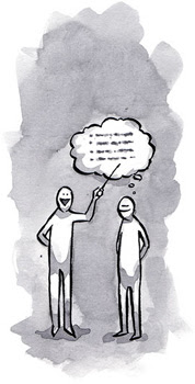
WARNING WITH MAGIC LINKS (MAGIC LINKS)
Login links
It can be assumed that everything started with the Slack service, but now many websites provide users with a “temporary password”, for example, Notion. It is not hard to guess what the trick of such a move is – red tape with registration means that people should remember two values instead of one and will use the link “Forgot password”, but:
This approach is incredibly tedious. Visitors to the web resource will have to: enter an email address; open a new tab or enable the program in order to enter the mailbox; find a message from the support service (without being distracted by other letters); open the letter and copy the password, similar to abracadabra; return to the website where you enter a crazy character set and, finally, fill in the login form. Hell!
Particular irritation causes incompatibility with managers / memory of passwords, and in fact today many rely on them. With the advent of design systems, design has often begun to talk about a consistent logical approach, but it’s not only within its ecosystem that it’s about – the product must be compatible with the rest of the global web.
This option forces to learn new principles of work on the Internet. For many years, users have again and again faced with a variety of “notions” and innovation in web design / development. Introduction of innovations, of course, is necessary, but one important fact should be taken into account – people visiting your site already have accumulated knowledge on the use of popular Internet technologies and services. Some developers, amateurs beyond their control, force their target audience to learn something new that hinders work (at least at first). What for? It’s just an authorization!
DO NOT DESTROY THE LOGIN PROCESS IN MULTIPLE STEPS
Login in several steps
The implementation of the Shopify service is divided into three (!) Separate screens. Again, apparently, site developers are trying not to immediately overload users with a large amount of information.