The principle of the golden section in the design of sites
 A key indicator of the quality of web design is how natural and easy it is perceived by users. When creating a visual site design, it is important to illustrate the functionality and informative component of the project, to form its correct perception. The use of classical techniques such as the rules of the golden section in the design helps to solve such problems in an optimal way. We will consider it today.
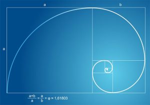
This principle describes a mathematical proportion that forms a harmonious, natural relationship of the parts of one whole to each other. It is obtained by dividing the whole into two parts so that the ratio of the first part to the second is the same as the ratio of the whole to the first part.
The principle and formula of the golden section
Among the first rule began to use the ancient Greek sculptor and architect Phidias. After two centuries, Euclid gives his exact mathematical description. Some time later, Leonardo da Vinci will apply the same idea in his works. His Vitruvian man, created according to the rule of the golden section, later became an illustration of harmony and proportionality in the construction of the human body in particular and of the Universe in general.
The embodiment of the ideal proportion can be seen in many places: in full-blown flowers, works of art, images of the Milky Way.
The golden ratio in nature
THE RULE OF GOLD SECTION IN WEBSITE DESIGN
As we said above, the proportion created on the principle of the golden section is perceived as natural and harmonious. Therefore, designs built with its help are more understandable and user-friendly. When developing a website, this approach is not always used, but the traditional layouts for creating layouts are somehow based on it.
There are several options for applying the golden section rule in web design.
1. DIMENSIONS OF BLOCKS AND ELEMENTS ON THE PAGE
The proportion described above is used when zoning a page, as well as forming individual blocks, if they need to be divided into two proportional parts. For calculations, use the number Φ, approximately equal to 1.62 (a more accurate value – 1.618).
Golden ratio in design
For example, you have a block width of 640 pixels. So:
The height is calculated as follows: 640 / 1.618 = 396 px.
The same will be the width of most of the proportion (left in the picture above) = 396 px.
Whereas the width of the smaller area = 640 – 396 = 244 px.
If you apply the formula of the golden section in the design of sites, then:
for a 1024 px layout, we get 633 px parts for content and 391 px for the sidebar;
if you take a width of 1000 px, then the columns will be 618 and 382 pixels each;
in a 960 px wide design, the layout is divided into 593 px and 367 px.
Golden Ratio in Smashing Magazine
The golden section rule corresponds to proportions 3/2, 5/3, 3/8, etc. In percentage terms, the division of the integer by the number Φ is performed as 62/38%. It can be used not only in building blocks, but also in the typography of the site:
Font size according to the golden section rule
If the header size = 20 pt, then for the content block we get 20 / 1.618 = 12.36 pt (in principle, rounding to 12 or 13 pt is allowed). By the way, you can take a look at one interesting service on the topic – Golden Ratio Typography Calculator (calculator of the golden section for texts).
Golden Ratio Typography Calculator Service
In the left column, you define one or several parameters (font size, content width, number of characters per line), after which the project will generate the best and best typography options. In the column on the right, you can change fonts by viewing the results in real time. If you click on the link “Font Size”, you will see the recommended sizes of different headers.
2. APPLICATION OF NUMBERS
Fibonacci numbers are considered a mathematical rationale for the golden section. This is a sequence of integers from 1, in which each successive number is the sum of the two previous ones: 1, 2, 3, 5, 8, 13, etc. Fibonacci series are used in the construction of multi-element layouts. The dimensions of the elements increase according to the increase in the values of the numbers of the series. In practice, it looks like this:
Fibonacci numbers
The Fibonacci series is optional for building squares. These can be circles, ovals, etc. Here are a couple of examples from one English-language note.
It is not surprising that in this project the necessary proportions are strictly observed. Large companies often hire good specialists who are able to properly develop their brand. The main content is located in the block number 1, the navigation elements within the block number 2. If you look at the sidebar, even there you will find the embodiment of the principle of the golden section in the design – the ratio of the size of the selected article and the advertisement under it.
Here the proportion is implemented in a slightly different way – not horizontally, but vertically in each of the columns separately. Rate the place that takes the title in block number 3.


