
Creating beautiful RSS icons for your blog
 Creating beautiful RSS icons for your blog
beautiful RSS icons for the blog. For those who do not yet know RSS – a special format of blog posts that allows you to receive updates from the site without having to visit it. For reading, special programs are used – RSS readers (for example, Google Reader).
As a rule, each blog has a button that allows you to subscribe to your blog articles via RSS. It can be located anywhere, but should be noticeable, it is often placed in the sidebar closer to the header of the site, sometimes it is given an impressive size for visitors to notice. In any case, the user should not specifically look for it.
rss icon In principle, the RSS icon has a certain standard, so to speak – an orange color with a white image inside. However, recently designers began experimenting in this direction, creating original and unlike each other icons. So why don’t we draw something of our own too!
Let’s start creating your own RSS icons for your blog – for this you need to perform 3 simple steps.
Step 1. Creating a form
Download the set of forms for RSS icons. To connect them to Photoshop, find the directory where it is installed and copy the * .csh file to the Presets \ Custom Shapes folder. Next, in the photoshop graphic editor, in the sidebar of the toolbar, select an element with forms (point 1 in the figure below):
shapes for photoshop
A block with elements of different forms will appear in the top control panel. When you click on it, a window will appear with an available set, to the right of which there will be a small arrow. Click on it and select Load Shapes in the drop-down menu in order to load new forms. After that, the number of available items will increase.
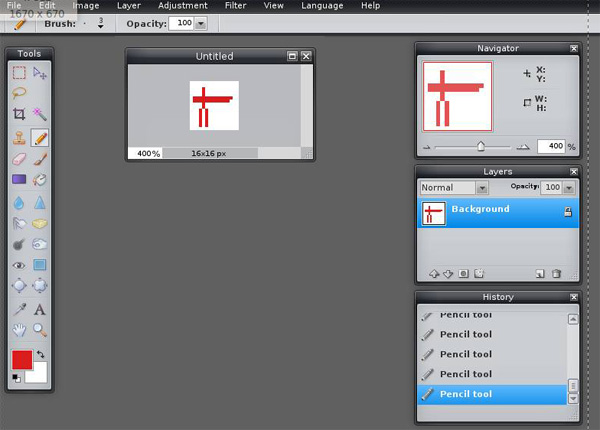
We choose the shape we need and begin to draw. Holding down the Shift button, we get the “correct shape” without stretch marks in width or height. The form is ready, the corresponding layer is created.
forms photoshop
Step 2. Set the style for the icon
A style is a set of properties for an object (shadow, glow, contour), which are grouped into a single whole and are applied to a particular element with one click of the mouse. In the last post I wrote about beautiful styles for Photoshop, where I pointed out links to 2 archives with styles (you can download them there).
Before using styles, they also need to be installed. To do this, in the Edit section of the main menu, find the Preset Manager item.
Setting styles in Photoshop
In the drop-down list, select the item styles. After selecting a list of existing items will appear. To load new you need to click the Load button. After completion click Done.
Now we actually apply these very styles. To do this, firstly make sure that the desired element with the shape is selected in the layers, then click on any style you like there. The result will be immediately applied.
Working with styles in photoshop
Step 3. Cosmetic edits
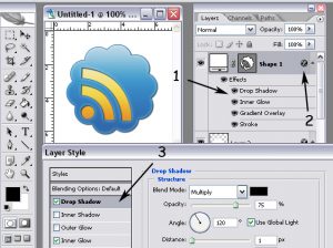
Now, based on the knowledge gained, we can slightly improve our icon. To do this, add another layer (point 1 in the figure below), and it should be located under the layer with the form:
a lesson with styles in photoshop
Select the rectangular area that completely covers the drawing inside the icon (point 2). After that, select the fill tool (item 3) and fill the selected area with the default color. Then again just click on the style you like and it will be applied to this rectangular area.
As I said, style is a combination of different properties of an object. If you look at the layer, you will notice a list of these same properties (point 1 in the figure below):
photoshop styles
Therefore, you can make your own changes to each style. To do this, double click on the icon (point 2) and in the pop-up window you will create new style settings. You can, for example, add a shadow in the shape (point 3). To save the changes, click “OK”.
After all the settings, connect the visible layers of the image – the Layer section in the main menu, the MergeVisible item (or Ctrl + Shift + E).