articles or thoughts
Headers for website or blog
 Authors blog is a kind of virtual representation, so it must look unique. The problem is that most of the free templates (if not all) are available to everyone on the network, so there is a great chance to meet two absolutely identical sites. I am talking now exclusively about the design of the site header and other elements of the layout, since this is the first thing that catches the eye of the visitor. This can be compared to when you go to a party or a holiday and meet a person who is dressed exactly the same. I can assume that you will hate him and will avoid him in every way 🙂
Headers for website or blog Continue reading
Creating beautiful RSS icons for your blog
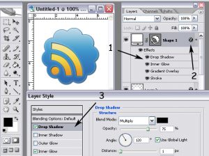 Creating beautiful RSS icons for your blog
beautiful RSS icons for the blog. For those who do not yet know RSS – a special format of blog posts that allows you to receive updates from the site without having to visit it. For reading, special programs are used – RSS readers (for example, Google Reader).
As a rule, each blog has a button that allows you to subscribe to your blog articles via RSS. It can be located anywhere, but should be noticeable, it is often placed in the sidebar closer to the header of the site, sometimes it is given an impressive size for visitors to notice. In any case, the user should not specifically look for it. Continue reading
In defense of “Eye Candy”
 In the society of designers, it is often possible to hear that true professionals build their work on the strict conformity of design to the brand’s corporate style or simply on the basic principles of design, and aesthetic beauty fades into the background. Living discussions on this issue lack one thing: understanding that aesthetics plays a huge role in cognition, perception and reaction.
Take a look at what “clothes” designers “now wear” with ordinary ready-made structured information; or how the term “eye candy” reduces the significance of graphic design as such. Language, at the present stage, narrows the concept of “design” to a simple “design”, as well as separates “aesthetics” and “usability” (as if they are two completely different areas). Continue reading