
Why cancel buttons should be colorless
 What exactly does the Cancel button do? It returns the user to the previous screen. For users, Cancel is a means of protecting against unwanted changes in the system. To make users feel safe, the Cancel button should mean a retreat to reliability, not a call to action.
That is why the Cancel buttons should be colorless.
Neutral color for neutral button
The color on the buttons indicates a call to action. Cancel is not a call to action, because after pressing it no changes occur in the system. That is why you should not highlight it in color. In the opposite case, you create a false impression on users.
Users on the subconscious should feel that “Cancel” is their quiet bay in a sea of systemic changes.
Cancel is not an action.
Neutral color means a neutral, non-actionable button. When users notice that the Cancel button has no color, they quickly recognize it as a fallback. This is important for people who mistakenly activate the confirmation screen and want to return everything as it was.
When each button on the screen has a color, they “compete” for the user’s attention. This forces users to think about every action longer. The neutral color cancel button allows them to make decisions faster. Those who want to perform an action will not be distracted by the “Cancel” button.
“Cancel” a lot of names
Not all cancel buttons are called “Cancel”, but the principle of their operation is identical. Returning to the previous screen may be called “Not Now,” “No, Thank You,” “Maybe Later,” or “Skip,” depending on the context.
If your button – whatever it is called – implies a cancellation of any action, you should consider it as the “Cancel” button. It performs the same function.
See also: How to use animation to improve UX
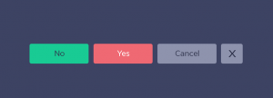
The user understands how to get away from the choice of action
The more buttons on the screen, the more important it is to make a clear departure from the choice. Look at the example above. On the screen on the left you have to read all the options to understand. On the right you do not even need to read.
Dark gray enough
When using gray on the button, it is important to make this color dark enough. Otherwise, the button may appear as disabled. Contrast can be easily checked using tools like Contrast Checker.
Light (indiscernible) gray and dark gray (clearly visible)
Make your button neutral
In most cases, when users activate the confirmation screen, they are ready for action. But if it happened by chance, or the user simply changed his mind, the “Cancel” button should be a salvation for him.
The color Cancel button sends the wrong signal. It confuses users, forcing it to be considered as yet another call to action. Make your button neutral so that the user has more control and freedom when using your application.