codes of web colors
What can you learn in Japanese website designs?
 Back in 2014, we published an interesting selection of designs of Japanese anime sites. Surely you can guess that the works there are presented quite specific and original. They are very different from the generally accepted standard approaches to web design, for example, in Europe or the United States. The visual design of Japanese online sites is very colorful, it uses a lot of different bright graphics, images, plus the pages are literally “crammed” with texts. Continue reading
Social networks for designer career
 Today’s topic, as you already understood, will be connected with the use of social media by employees of the sphere of design and not only. Moreover, unlike the article on useful social networks, the article will deal more with the career of a designer than with his immediate activities. The inspiration for writing the post was the English-language publication 6 of Creative Social Media Strategies for Designers. Continue reading
Trends and trends in web site design
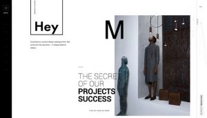 It was originally planned to place a translation of an English-language article on web design trends in 2017, but after studying various sources, we decided to slightly change the concept of this note. The thing is that over the past month on the Internet has been published a lot of thematic materials about current trends in web design, and opinions, as they say, have diverged. On the one hand, this is logical, since different authors have their own assumptions about what will be relevant for sites in the current year. On the other hand, these forecasts are very subjective. Continue reading