demonstrate stress or effort
Ways to navigate users on the site
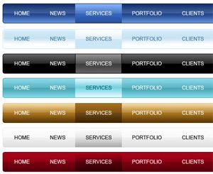 Imagine that you are traveling by car, but because of traffic jams all main roads are blocked, and you need to turn into an unfamiliar part of the city. For some time traffic signs will help you to move in the right direction, but suddenly they will disappear. It seems that getting lost in an unfamiliar place is a pushover.
Any site, regardless of its ultimate goal, should perform the main task – to indicate to the user the path to the information of interest. However, it is possible due to his own fault, and maybe the fault of the designer, the user is lost and does not know where to go next. How to help your visitors navigate the site. There are several effective ways. Continue reading
6 Tips for creating one-page websites
 Single-page websites are becoming popular and fashionable now – there is no doubt about it, although they are not suitable for every subject or organization. However, if done correctly, your project can be very successful.
When creating a landing page, as a rule, there is not a large amount and volume of content. You have only one page to deliver your message, and only a limited number of tricks and animations that you can use before the user loses interest. Continue reading
Using textures in web design
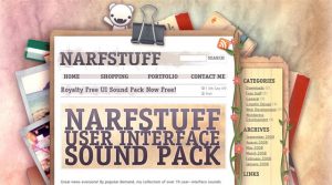 What is the easiest, correct, and sometimes the only possible way to create the illusion of the relief of an element (object) in web design (as well as in 2D in general, and of course 3D)? Correct – use texture! Being a “material” universal, textures are widely used in web design and are subject to endless experiments. Textures on the sites can be found as simple, which only emphasizes certain elements of the project, and much more complex implementation. Inspired by this publication, I propose to consider several options for using textures:
“THIN” USE OF TEXTURE Continue reading
